
Blog
Welcome

Recent posts
SEARCH RESULTS FOR: Responsibility
Previous | Contents | Next Download the eBook Bad taste takes a while to show up, but as soon as it does it’s embarrassing. How to avoid it? Start by keeping it simple. If in doubt, leave it out. The half life of crap In her book The Mesh, Lisa Gansky talks about “the half life of crap” – about cheap manufactured products and how long they last. Or rather don’t last. Her point is that the half life of crap products is way too short. They get boring or they break. They end up at the back of your garage or as land fill. Our poor planet can’t afford To View More >>

Previous | Contents | Next Download the eBook If the first time you think about me is when you realise I’m blocking the sale, too late! Some years back there was a young man called Nigel working at Queensberry. He was about to get married, and that's how the following exchange got started. It prompted me to write a post in which I said that, to hear people talk, you’d think that only two people are involved in buying a wedding album – the bride and her mother. Same with portrait shoots, I was sure. I couldn't imagine To View More >>
Previous | Contents | Next Download the eBook "They’re proud of their family or their new baby. Proud of their farm, cars, horses, dogs. Proud of the party they put on for the wedding..." Pride — personal and professional We’re in the “love” business, yes, but we’re in the pride business too. Professional pride in your case, but with your clients it’s personal… They’re proud of their family or their new baby. Proud of their farm, cars, horses, dogs. Proud of the party they put on for the wedding — the location, the spread, To View More >>
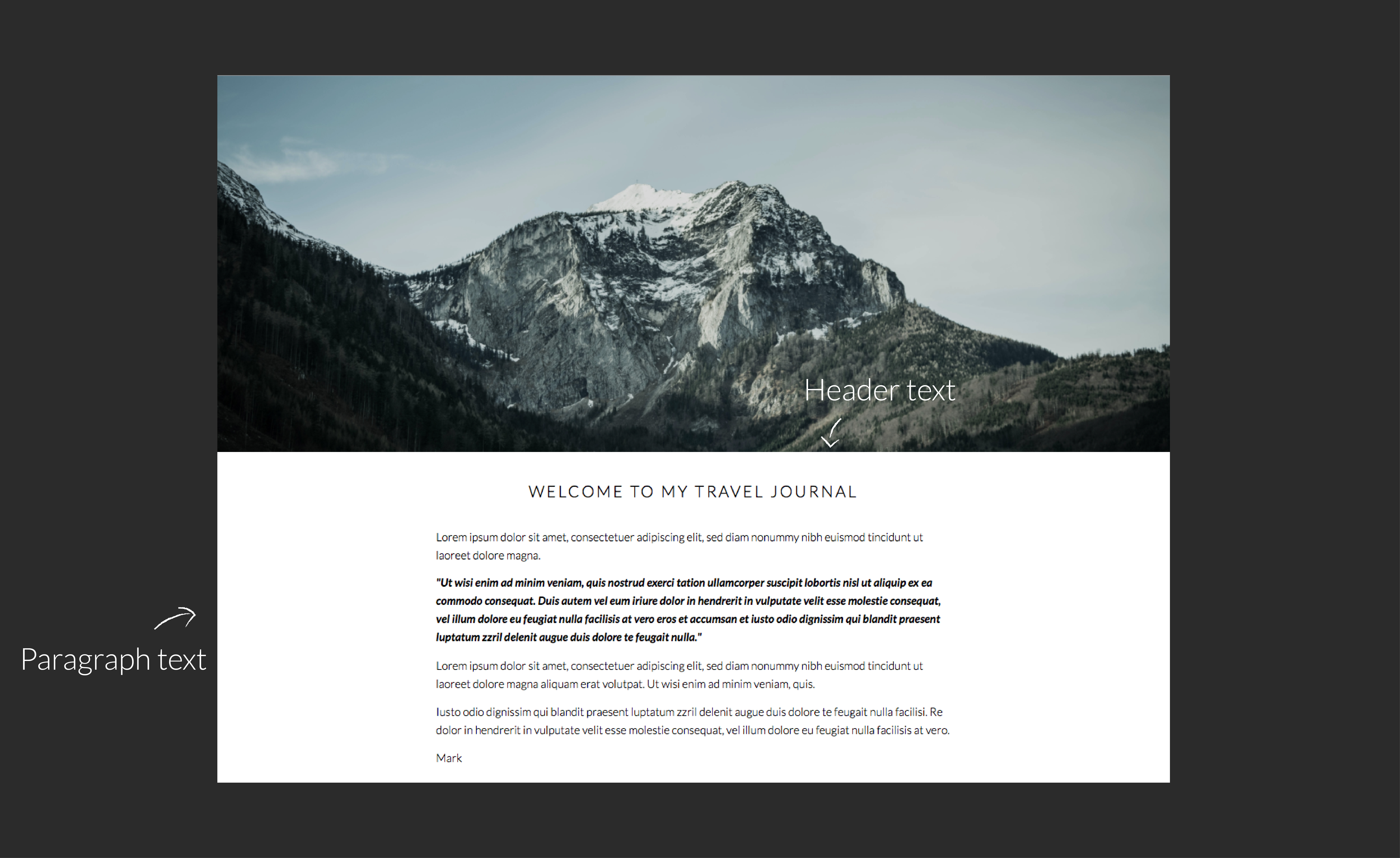
Typography plays an important role in the overall look of websites, so it's no surprise that one of the common things people want to do in Workspace is change fonts. Workspace offers a range that you can select from in the text widgets (as in the graphic) but what if you want something completely different? This tutorial will explain what to do. Warning! This will get a bit geeky, so if you're not comfortable coding CSS and HTML, contact us and for a small charge we can arrange to do the work for you. Otherwise get someone else with the necessary experience, as we To View More >>

CHOICE, TRUST AND TECHNOLOGY Has your lab stopped offering traditional silver halide printing? It’s sad to see such a gloriously refined technology abandoned. With forty years pro lab experience, and chemicals in our veins, we aren’t ready to turn our backs on traditional photographic printing just yet. In fact we think it retains an important place, and we’re committed to the technology. But here’s why the Big Boy Labs are selling the line that silver halide is finished. Their top priority is, and must be, internal efficiency. They have expensive, high-volume machines to To View More >>

When our friends from NZTE (New Zealand Trade and Enterprise) wanted a customised book designed for Judith Thompson, the retiring Director of Better by Design, we were more than happy to jump aboard. The brief was for Queensberry to design, print and bind a book filled with photos and personal messages supplied by staff, clients and friends from her time with NZTE. Click on the images to take a closer look. Judith’s overall responsibility included a range of design education initiatives including the regional CEO talk series, study tours to Silicon Valley and Better By Design's annual CEO Summit. To View More >>

Pete started off his recent posts by saying that colour management is one of the cornerstones of digital photography, but often misunderstood. Let me describe what you can reasonably expect from a sound colour management system consistently applied (certainly not miracles!). What you can expect 1. A reasonable indication of what your final print will look like (assuming you're sending the files print-ready). 2. To avoid gross errors (an Adobe 1998 file treated as if it's sRGB will look strikingly different, especially if colours go out of gamut). 3. Predictability: You can send your files to the To View More >>

Ian likes to talk about the good old days, when colour correction and colour management were a matter of picking up the phone and complaining to the lab. OK … I remember them too. Well, you can still outsource colour correction, but colour management is a shared responsibility now. In my earlier post I talk about screen calibration and soft-proofing, which most of us at least know about - but few people understand that taking all the care in the world over those won't be enough if your working environment is wrong. Try this experiment. First thing in the morning, sit down at your desk (where To View More >>

In many labs these days the only people who look at your prints are the Dispatch team. Strange as it seems, that makes sense – it's your files they’re printing, and something has to give if you want low prices. But it doesn’t make sense at Queensberry. We critique everything we print, including Print-Ready. The difference is we see the image files with Full Colour Service (because it’s our job to colour correct them) whereas we don’t see Print-Ready work until it’s printed . But why review Print-Ready work at all? Print-Ready means you edit your images yourself, and we don’t modify To View More >>
Queensberry's colour correctors are passionate about their work and achieving a result that pleases you, but even if you're not using their services the way they approach the job is worth thinking about. When they get an order, the first thing our colour correctors do is open up all the layouts to get a 'feel' for the overall colour of the album. Their goal is to optimise key elements like flesh tones or a bride's dress, and to achieve a consistent, natural look across page layouts and the entire album. Often we see albums where individual images have been tweaked without thought for how they To View More >>
Email: info@queensberry.com
Free Phone Numbers:
New Zealand: 0800 905 905
Australia: 1800 146 251
USA: +18668350851
UK: 0800 808 5271
Canada: +1 855 581 0370